
Football fashion is fast becoming a staple in streetwear, and the World Cup is an excellent opportunity to showcase the participating nations’ threads for the whole world to see. Some take our breath away, others make us turn our noses up. This piece will cover five of the latter, plus a few dishonorable mentions. Enjoy!
5. Saudi Arabia Home

This is not a horrible kit, but among the threads at this World Cup, it definitely does not impress. The color palette of green and purple just do not go well together, and the geometric pattern on the front just makes it seem rather jarring. A downgrade from their 2022 kits, which were sponsored by Nike instead of Adidas. That’s saying something, since the 2022 kits were not too impressive either.
4. Belgium Away

Whatever Adidas was trying, they tried too hard. The washed out mint and pink background does not look good, and the pink dots splashed on the front look like either bubble gum or mold. Does it look better in person or on screen? Answer: they don’t look good on either.
3. Switzerland Away

First question: why green? The kit looks much more like a Nigeria kit than a Switzerland kit. It is a color very hard to associate with the Swiss, and the pattern does little to soften the blow. The kit is likely to have traditionalists up in arms, and while they may stand out, it will not be in a good way.
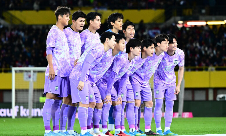
2. South Korea Away

This writer’s country has tried something new, but it was not the way to go. The kit was inspired by the national flower of Korea, the Mugunghwa (or the rose of Sharon in English), but it does not remotely resemble it. If anything, it looks like a cheap blanket that one might find at their grandparents’ house. Washed out purple does not suit Korea at all. Such a shame, since the home kit actually looks pretty decent.
Dishonorable Mentions
Ivory Coast Away

Again, just tried way too hard and made a kit look too jarring instead of clean.
Brazil Away

The color is not the problem, but the pattern just looks confusing.
1. Ghana Home

Did someone try their hand at stained (broken) glass on a football shirt? Or did a rainbow spider spin a web while intoxicated? Whatever the case, Ghana’s home kit looks horrendous, like the designer decided to let a toddler run riot with a bunch of colored pencils. With the team having been in turmoil for the past few months, Ghana has a shirt to match their chaos. Only a good run at the tournament will somewhat redeem it, but even that seems like a long shot.
So there you have it! What is your least favorite kit of the tournament? Let us know in the comments!
If you are looking for more Bayern Munich and German national team coverage, check out the latest episodes of Bavarian Podcast Works, which you can get on Acast, Spotify, Apple, or any leading podcast distributor…
Join the conversation!
Sign up for a user account and get:
- New, improved notifications system!
- Fewer ads
- Create community posts
- Comment on articles, community posts
- Rec comments, community posts